let's work together :)

BAT YAM CONSERVATORY
Brand Identity | Icons Design | Print Design
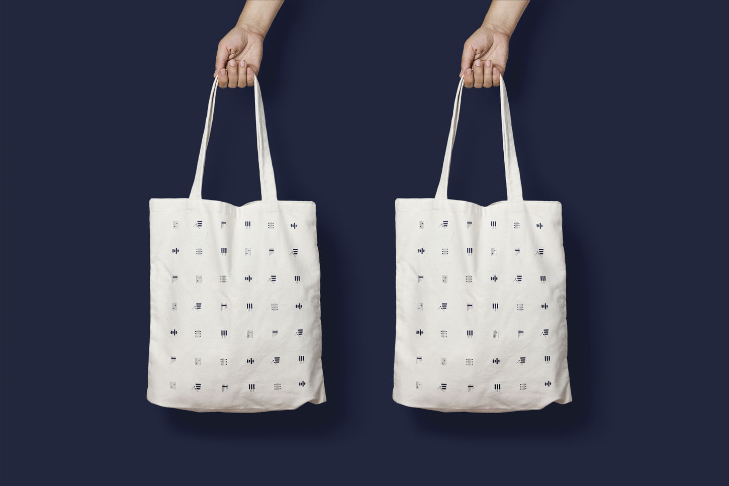
The conservatory approached me with the aim of rebranding the institution in a more modern and accessible way. My main inspiration for the visual language were the tools themselves. I created the logo from the last three letters of the conservatory (in Hebrew) and combined it with elements of string instruments. Subsequently, the logo inspired a language made up of abstract shapes that create musical instrument icons. The Hebrew typography is elegant and contains movement. For the colored palette, I chose to use one color - a state blue that would be identified with the high level of the conservatory.
The identity reflects the core values of the brand: Versatility, modernity and creativity.


